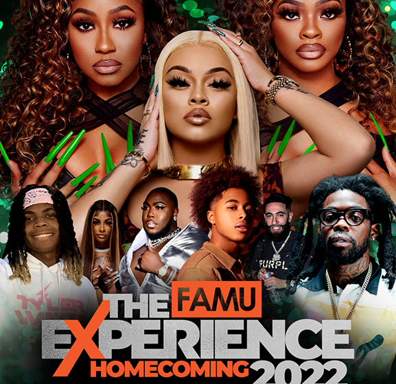
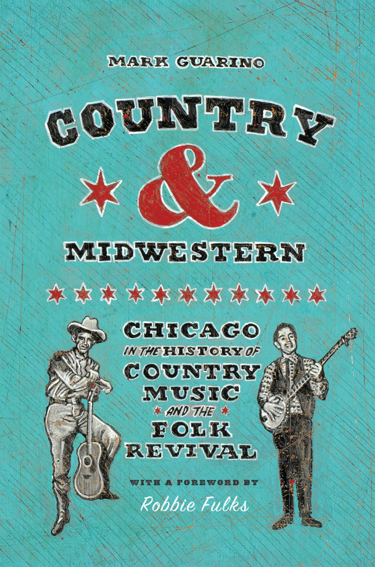
Are you ready to dive into the world of designing captivating concert posters? Crafting a visually appealing and informative concert poster is crucial for attracting attendees and setting the tone for the event. In this blog, we will explore the step-by-step process of creating a stunning concert poster that will grab attention and leave a lasting impression. From selecting the right imagery and typography to understanding the importance of color schemes and composition, we will guide you through the essentials of poster design.
Whether you’re a beginner looking to learn the basics or an experienced designer seeking new inspiration, this guide will equip you with the knowledge and skills to master the art of making a concert poster that stands out. Get ready to unleash your creativity and learn how to make a concert poster that truly shines!
Introduction to Creating Concert Posters
When it comes to promoting a concert, an eye-catching poster plays a crucial role in grabbing the audience’s attention and conveying the essence of the event. In this digital age, knowing how to make a concert poster that stands out both online and offline is essential for any event organizer or artist.

The Importance of Visual Elements
Visual elements such as color scheme, typography, and imagery are key components of a compelling concert poster. The design should reflect the genre of music and create a visual language that resonates with the target audience.
Utilizing bold colors and creative fonts can help your poster stand out in a sea of advertisements.
Key Information to Include
When creating a concert poster, make sure to include essential information like the artist/band name, date, time, venue, ticket details, and any special guests. The details should be clear and easily readable to ensure potential attendees can quickly grasp the necessary information.
- Artist/Band Name
- Date and Time
- Venue Details
- Ticket Price and Purchase Information
Gathering Inspiration for Your Poster Design
Before diving into creating your concert poster, it’s essential to gather inspiration to kickstart your design process. One of the best ways to gather inspiration is by exploring existing concert posters from various genres and eras. Look for innovative designs that catch your eye and analyze what elements make them successful.
Exploring Online Platforms
Start by browsing online platforms such as Pinterest, Behance, or Instagram for a wide range of poster designs. Use keyword searches like “concert poster design” or “music event posters” to find specific inspirations.
When searching for how to make a concert poster, consider the latest trends in poster design to ensure your poster feels current and engaging.
Attending Live Events
Another great way to gather inspiration is by attending live concerts and events. Pay attention to the posters displayed at the venue entrances. Take note of the color schemes, typography choices, and layout designs that resonate with you.
Immersing yourself in the concert atmosphere can spark creative ideas for your own poster design.

Choosing the Right Imagery and Fonts
When creating a concert poster, selecting the appropriate imagery and fonts can significantly impact the overall appeal and effectiveness of your design. To attract the target audience and convey the essence of the event, it is crucial to carefully choose visuals and fonts that align with the concert’s theme and style.
Relevance to the Concert Theme
Ensure that the imagery and fonts you select are relevant to the genre and mood of the concert. For example, vibrant and colorful graphics may be suitable for a pop music event, while grungy fonts and edgy visuals could complement a rock concert.
Consistency in Design Elements
Consistency is key in creating a visually appealing concert poster. Make sure the imagery, fonts, and colors harmonize with each other to maintain a cohesive look throughout the design. This helps in creating a unified and professional appearance.
Legibility and Impact
Ensure that the fonts you choose are legible and easy to read, even from a distance. Bold and clear typography can enhance the poster’s visibility and make important information stand out. Additionally, striking imagery can grab the viewer’s attention and create a lasting impact.

Adding Important Details: Date, Time, Venue
When creating a concert poster, including essential details like the date, time, and venue is crucial to inform your audience about the event. These details help attendees plan their schedule and know exactly where to go to enjoy the concert.
Choosing the Date
Deciding on the date is the first step in creating a successful concert poster. Ensure the date selected doesn’t clash with other events to maximize attendance. Highlight the date prominently on the poster.
Selecting the Time
When choosing the time for the concert, consider your target audience’s preferences. Include both the starting and ending times to give attendees a clear idea of the event duration.
Picking the Venue
Make sure to feature the venue prominently on the poster. Include the full address and any additional information like parking availability. Choose an image that showcases the venue’s ambiance to entice potential attendees.
Designing a Striking Layout
When creating a concert poster, the design layout plays a crucial role in attracting the audience’s attention and conveying the event’s vibe. To craft a striking layout that stands out, consider the following elements:
Eye-catching Typography
Choose bold and dynamic fonts that reflect the music genre and the event’s mood. Experiment with font sizes, styles, and colors to create contrast and visual interest. Remember to keep the text readable amidst the creative design.
Strategic Use of Imagery
Images are powerful tools to capture attention. Incorporate high-quality visuals like photos of the performing artists or unique graphics related to the concert theme. Make sure the imagery aligns with the overall design scheme.
Incorporating Branding Elements
When it comes to **how to make a concert poster**, incorporating branding elements is crucial to stand out and create a memorable visual identity. Consistent branding helps to establish recognition and build an emotional connection with the audience.
Color Palette Selection
Choose a **color palette** that reflects the tone and vibe of the concert. Consider using colors that resonate with the music genre or the mood of the event. Incorporate your brand colors to maintain brand consistency.
Typography and Fonts
Select **fonts** that are easily readable yet impactful. Experiment with font styles that complement your branding. Play with typography hierarchy to emphasize important information and create visual interest.
Logo Placement
Integrate your **logo** strategically into the poster design. Ensure the logo is prominently displayed but doesn’t overwhelm other elements. Position it where it can be noticed easily and reinforces your brand identity.
Visual Imagery
Include **visual elements** that align with your brand aesthetics. Use high-quality images that evoke the desired emotions or convey the event’s theme. Incorporate graphics or illustrations that resonate with your target audience.
Printing and Distribution Tips
When it comes to creating concert posters, printing and distribution play a crucial role in reaching your target audience effectively. Here are some essential tips to ensure your concert posters get noticed:
Quality Printing
Invest in high-quality printing to make your poster visually appealing. Vibrant colors and sharp images can attract more attention. Consider using a professional printing service for best results.
Additionally, printing posters with a glossy finish can make them stand out and enhance their overall look.
Strategic Placement
Choose strategic locations for distributing your concert posters, such as music stores, cafes, or local hangout spots. Make sure to get permission before posting in certain places.
For a wider reach, consider placing posters in high foot traffic areas or utilizing online platforms for digital distribution.
Frequently Asked Questions
- Why is creating a concert poster important?
- Concert posters play a crucial role in promoting and marketing a concert or event. They grab the audience’s attention, convey important information, and generate excitement.
- What are the key elements to include in a concert poster?
- Some key elements to include in a concert poster are the event name, date, time, venue, ticket information, lineup, eye-catching visuals, and sponsor logos if applicable.
- What design tips can help in creating an effective concert poster?
- Design tips for creating an effective concert poster include choosing a visually appealing color scheme, using high-quality images, incorporating readable fonts, creating a focal point, and keeping the layout clean and organized.
- How can one distribute concert posters effectively?
- Concert posters can be distributed effectively by displaying them in high traffic areas, utilizing social media for digital promotion, partnering with local businesses for distribution, and sending them to relevant mailing lists or fan bases.
- What tools can be useful for designing a concert poster?
- Tools like graphic design software such as Adobe Photoshop, Illustrator, Canva, or online poster makers can be useful for designing a concert poster. Additionally, using imagery and font resources can enhance the poster.
Final Thoughts: Elevate Your Concert Poster Design Skills
Mastering the art of creating a concert poster is a blend of creativity, design skills, and strategic thinking. By following the step-by-step guide provided in this blog, you can now confidently craft eye-catching posters that capture attention and generate excitement for your event. Remember, the key elements of a successful concert poster include compelling visuals, a clear message, and effective placement of information.
Whether you are a graphic designer, a band manager, or an event organizer, honing your poster-making skills is essential for successful promotion. Experiment with different styles, colors, and layouts to find what resonates best with your target audience. By incorporating these tips into your poster designs, you can stand out in a crowded market and leave a lasting impression on concert-goers.